We invite the reader to consider some of the internet conventions, generated between prosumers online, to observe how visual genres create common language when navigating associative clusters that work well in the interests of work collaboration.
Here, we consider how styles and work conventions between content creators relate to the structural conditions of hybridity. In the first part, we analyze hybrid content on platforms like TikTok, and take a look at the recent controversy surrounding Corporate Memphis.
i. How did we get here?
Design movements develop in tangent with the logistics and labour conditions of its time. Art nouveau¹ came about as the world became more connected through the opening of trade routes, replacing European-historical styles with a new look for the international middle class. This went out of fashion with the rise of factories, which rendered Art Nouveau’s decorative style inefficient, as it wasn’t adaptable to production lines. Styles like bauhaus came to define the age of factory work, and pop art the age of mass production.
Throughout design history, there has been a give-and-take between the tendency to cater to personal taste, and the tendency to adapt to broader material conditions. For a long time, design has fluctuated between the personal and impersonal, and has now come to the point where it becomes hard to tell the distinction: Consumer tastes are cultivated by the internet user’s relationship to impersonal social media algorithms, and the boundary between the work/ life divide is dissolving with the gamification of work² through playbour³. These blurred lines define the shape of design in the current era; design following the hybrid workplace⁴, where workforces are decentralised, and remote and office work coexist.
ii. Aggregation: design logic in Hybrid Spaces
While prior design movements could be distinguished by visual characteristics (Art Nouveau was flowery and flowing, Bauhaus cold and mechanical), all visual traditions seem to have collapsed into a huge globalised melting pot. As such, it can be hard to define an overarching visual language for hybrid conditions. Rather than analysing visually, we discern a logic by which contemporary design operates: aggregation.
The logic of aggregation can be described as a sort of “reverse-packaging”. To put it metaphorically: while a package designer in the Art Nouveau era would design a box to contain a product, creating packaging that communicates the tastes and values of the product’s audience, the hybrid designer first creates an “empty box”, letting values generated by the consumer aggregate within.
A good case study for the genesis of this design logic is the marketing for Monster Energy drink. In a brand document chronicling Monster’s marketing strategy⁵, Mclean Advertising states that its strategy was to “Intentionally create a brand that is sufficiently devoid of meaning, in order to be filled with significance for early adopters.” ‘Monster Energy’ is designed as a kind of anti-branding, an empty space that the consumer enters and decorates with a visual cloud of styles and subcultures⁶ that reflect their interests.The ‘Monster’ logo means nothing – its brand identity emerged through a collaborative process between designer and consumer, where consumers ‘filled in the blanks’ left by an ‘empty’ logo, associating it with other visual genres already established in other realms of consumer activity such as fashion and music. As such, the designer does not create an image with a stable value, but an image that is able to aggregate multiple values.
Monster energy logo
This logic of collaboration and hybridity has prevailed with the rise of the consumer internet – cultural commentators have noted the entertainment industry’s attempt to respond to this with the rise of ‘hybrid narratives’ – media that aggregates fan bases of other media⁷. Films such as Wreck-it Ralph and Ready Player One construct spaces structured to absorb other nostalgic franchises, with their narratives functioning strategically as an aggregator of intersecting fan bases⁸.
This ‘hybrid space’ logic is a key component in platforms like TikTok, whose creative engine runs on memetic collaboration, mashups, remixes and content aggregation. Virality now thrives on the ability to aggregate differences and intersect niches, rather than originality.
Think of the qualities of a TikTok trend – like the Monster logo, it is very often a sound or video clip with its original context “emptied out” to make space for consumer interaction⁹. To contend with this media environment, the designer’s role extends from the communication of meaning to the staging of collaboration. The designer doesn’t just oversee the straightforward role of illustrating a core message, but also creates space for the audience to participate in construction.
Instagram poll
iii. Making discontinuity continuous: The visual language of hybridisation
This collaborative fluidity among consumers is a trickle-down effect from norms established in the hybrid workspace. Play is influenced by labor, as organisational structures leave spaces for workers to augment work around their lives, bringing a personal dimension to the workforce. With so many blurred lines and styles and content aggregation, the designer’s role as a craftsperson is to make discontinuity continuous; to standardise elements that intersect different moments in a decentralised workflow.
A good case study for this practice of ‘making continuous’ can be found in the popularity of Corporate Memphis¹º, probably the most ubiquitous graphic style in the hybrid work era. Similar to the intersecting media franchises discussed before, the style emerges from 80s nostalgia¹¹. The bright, flat lines of Memphis design school becomes ‘emptied out’ of its retro associations and made timeless, lending to hybrid collaboration – it is easily convertible and customisable as vector art. Here, a universal visual language intersects with a universal format.
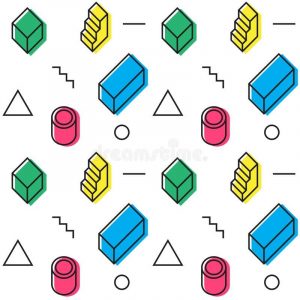
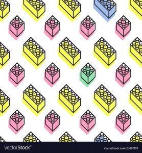
Memphis-styled stock vector wallpaper
The elements of corporate memphis strike such the perfect balance between using an impersonal style with personal expression, like a child’s lego construction. A designer could take over the working file of a designer with a different illustration style, and still produce an image that gels overall. Coherence is hardwired into Corporate Memphis, as different assets can be endlessly taken apart and re-combined to create different scenes. As such, the style was associated with accessibility, fluidity, and collectivism.
The use of Corporate Memphis became widespread because of its ability to stylise discontinuous work relations, and it’s ‘fun’ look congruent to workers carving out personal spaces in hybrid workforces. As such, it became ubiquitous in various forms of media, from editorial illustrations¹² to explainer videos¹³.
iv. What’s next?
As of this writing,Corporate Memphis has experienced a recent backlash¹⁴, not only going out of favor¹⁵ but receiving negative coverage¹⁶. What was once accepted as a visual language that represented a flexibility between work and play, became demonised as the invasion of big business in our personal lives, and the humanisation of impersonal business forces.
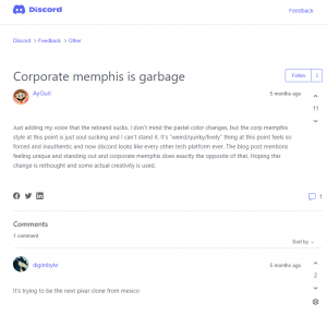
Discord commenters giving unfavourable reviews to a rebranding
Bearing in mind that the commentators and op-eds behind this backlash are not exempted from the business of the attention economy, a more neutral conclusion we could come to is that we are turning away from Corporate Memphis not because of values inherent in the style, but because our values have changed during conditions of the COVID-19 pandemic. For many, hybrid workspaces are no longer a luxury but the sole option, and what was regarded as a playful approach to work can now seem oppressive as many are confined to their homes during lockdown.
As of such, the give-and-take between the personal and impersonal continues – as we move slowly into the endemic stage, what will become the next visual language that reflects our efforts to find growth and agency during the new normal? The ball is in our court.
References
¹ Art NouveauCharacteristics, History of Curvilinear Design Movement.
² A ‘Playbour’ of Love for the Next Twenty Years – Pat Kane
³ Playbour: The New Workaholism
⁴ The Hybrid Workplace: Is this the future of work?
⁶ A Deep Dive Into the ‘Goths Love Monster Energy’ Meme
⁷ Intertextuality: Hollywood’s New Currency
⁸ Ready Player One (2018) and The Shining (1980) – visuals recreations comparisons
¹º Corporate Memphis; the design style that quietly took over the internet
¹¹ Memphis Design: the defining look of the 1980s
¹² Can psychologists work remotely? – editorial illustration
¹⁴ Why do “Corporate Art Styles” Feel Fake?
¹⁵ Why do some people hate the “corporate art style” (and what can you do about it)?
¹⁶ Why does every advert look the same? Blame Corporate Memphis

 651 Kotte Rd, Kotte,
Sri Lanka


